As someone who loves hands-on creativity, it’s no secret that Canva has become my go-to tool for designing book covers. The paid version offers so much flexibility, and it’s perfect for those who want to create something fresh from scratch. But let me tell you, the process isn’t always smooth! Some days, I end up with designs that look completely out of place – covers that may never see the light of day. Other times, I create something that clicks perfectly with the story and feels just right. It’s an ongoing journey of trial and error.
For those considering taking the DIY route for their book covers, here are a few insights I’ve picked up along the way.
1. Understand Your Genre
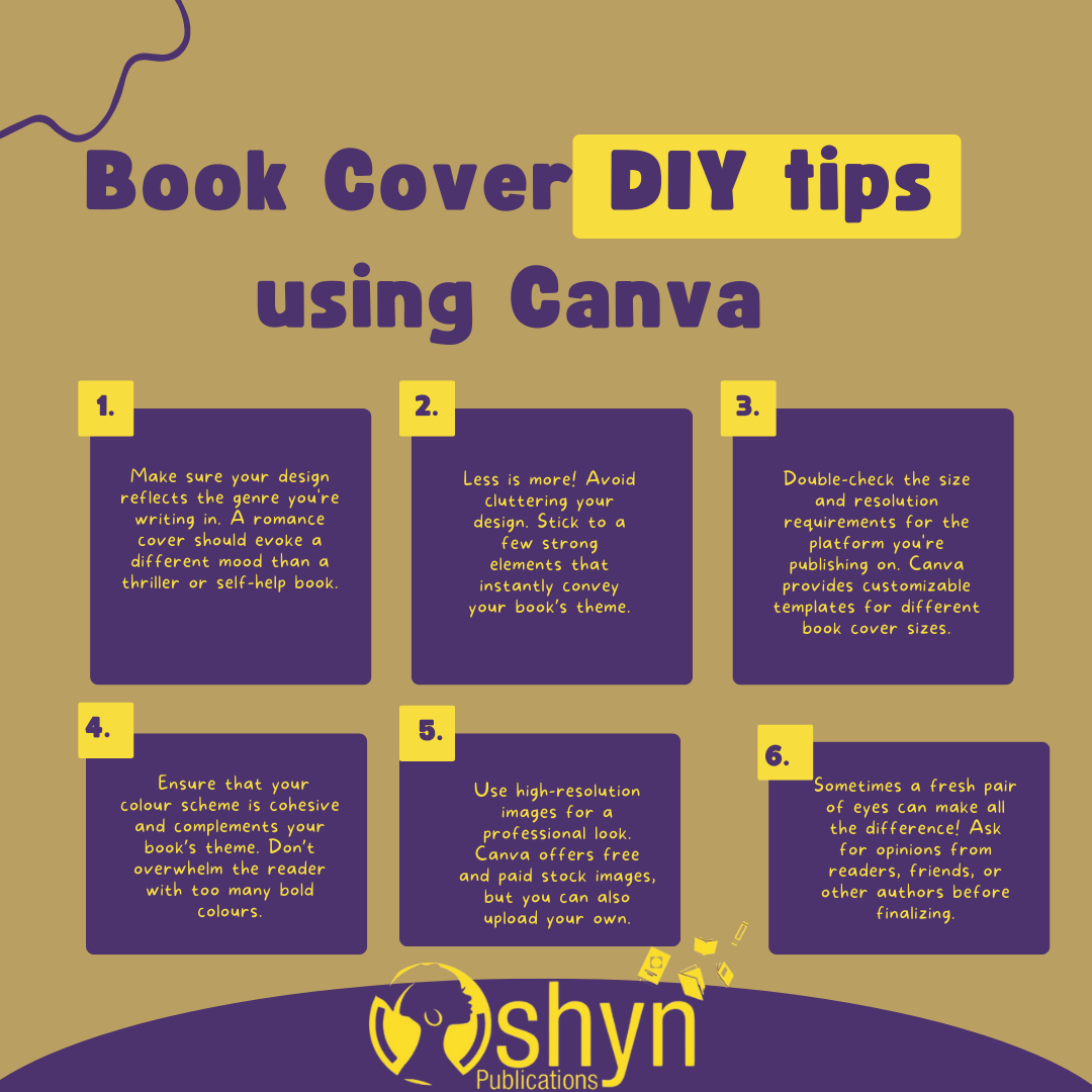
The most important lesson I’ve learned is that your cover needs to reflect your book’s genre. The cover is your book’s first impression – it’s the visual promise of what lies within. A romance novel cover shouldn’t look like it belongs on a thriller or a self-help book. Readers gravitate towards covers that instantly tell them what type of story they’re getting into, so research what works for your genre. Browse through bestsellers in your category and pay attention to recurring design elements. This insight will guide your creative process and help you make informed choices as you design.
2. Simple, But Powerful
When I first started, I often fell into the trap of adding too many elements to my covers. It’s tempting to try and include every little detail from your book, but I quickly learned that less is more. Your cover should be simple yet powerful, communicating the essence of your story with just a few strong visuals. Overcrowding the design can confuse potential readers or make the cover feel unpolished. Instead, focus on key visuals that grab attention and set the tone for your book.
3. Font Matters
One thing Canva offers in abundance is fonts. There’s a wide variety to choose from, but it’s important to pick one that aligns with the tone of your book. More than that, your font needs to be legible, even at a glance. I’ve seen great designs fall apart because the font was too fancy or didn’t match the genre. Take your time selecting a font that not only looks good but fits your cover’s overall theme and is easy to read, whether it’s viewed on a screen or in print.
4. High-Quality Images Are a Must
Blurry or pixelated images? No thanks. A cover is only as good as its visuals, and low-quality images can instantly make your book look unprofessional. I always use high-resolution images to ensure a crisp and polished look. Canva’s stock image library is vast and includes both free and paid options, but sometimes uploading your own images can give your cover a more unique and personal touch. Whatever you choose, ensure the quality matches the professional standard you want to project.
5. Colour Palette Counts
I love playing around with colours, but it’s important to make sure they work together cohesively. A well-chosen colour palette can evoke emotion and draw attention to your book. However, going overboard with too many bright or clashing colours can make your cover hard to look at or difficult to read. A cohesive, complementary palette that aligns with your book’s theme can make all the difference between a cover that pops and one that overwhelms.
6. Pay Attention to Sizing and Resolution
One thing that can trip you up is getting the technical details wrong. You don’t want to spend hours crafting the perfect design, only to find out it doesn’t fit your platform’s requirements. Whether you’re creating an eBook cover or a print cover, make sure you use the correct dimensions and resolution. Canva provides customizable templates for different cover sizes, but it’s always a good idea to double-check the platform you’re publishing on to ensure your cover meets their standards.
7. Get Feedback
Finally, no design is complete without feedback. As much as I love working on my covers, I sometimes get too close to them and miss obvious flaws. That’s why I always ask for feedback from fellow authors, readers, or friends before finalizing the design. A fresh pair of eyes can catch things you might overlook – whether it’s a font choice that doesn’t work or a colour scheme that needs adjusting. Constructive criticism will only make your design stronger.
Conclusion: The Beauty of DIY
Designing your own book cover can be an incredibly rewarding experience. It’s more than just another task on your self-publishing to-do list – it’s a chance to creatively represent your story, your way. The process may be messy, with trial and error along the way, but every time I sit down to create, I learn something new about both design and my own work.
If you’re thinking of DIYing your book cover with Canva, I highly recommend diving in and giving it a try. You’ll find that, whether your first attempts feel a bit off or you hit the mark on your first try, it’s a creative journey worth taking. And remember, don’t hesitate to ask for feedback before hitting publish!
Have you tried designing your own book cover? Share your experiences – I’d love to hear your thoughts!

Leave a Reply